
Place Before Trend
Regional character leads every design and content decision.
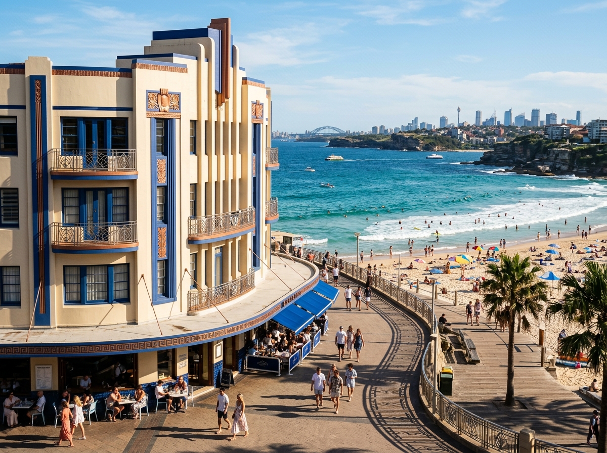
A hospitality collection shaped by Australian landscapes, materials, food cultures and city rhythms.
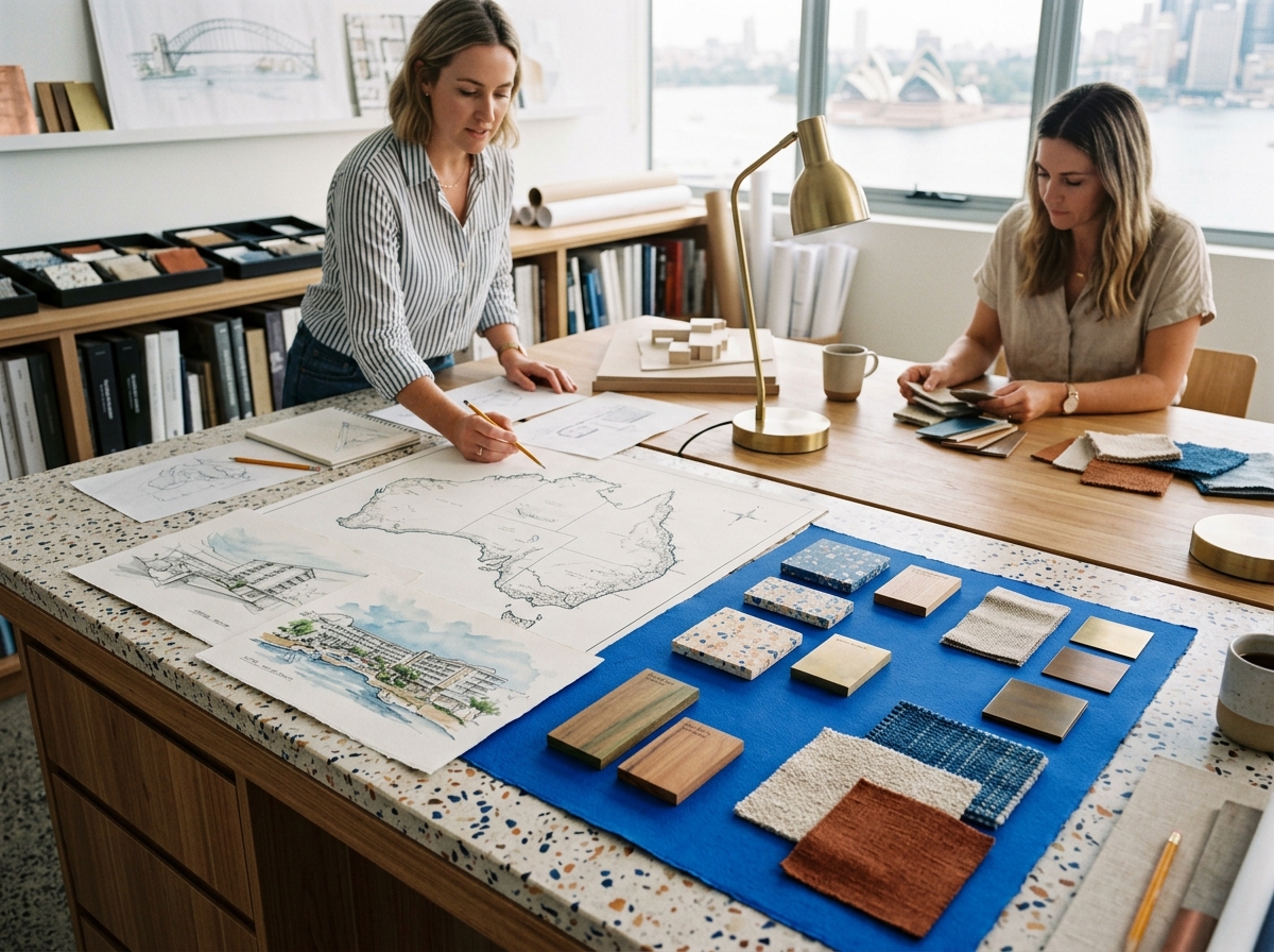
The project began with a simple idea: a hotel guide is more useful when it describes how a place feels across an entire day. A room matters, but so do the street outside, the breakfast room, the pool, the evening programme and the way guests move between them.
Location comes first. Each concept begins with climate, urban scale, local culture and the landscape visible from the property. Adelaide encourages an ordered architectural response. Hobart asks for stone, harbour views and warm interiors. Broome supports open-air spaces, shade and a palette taken from coast and earth.
Architecture is treated as practical storytelling. Materials, geometry and light make the hotels recognisable without relying on generic luxury signals. Every public area has a purpose, from a lobby that works as a meeting place to a lounge that allows guests to slow down.
Rooms are described by how they support rest: acoustic comfort, useful storage, views, terraces, work surfaces and simple access to concierge assistance. Restaurants receive equal attention because local produce and dining atmosphere often become the most memorable part of a short stay.
Wellness, events and cultural programmes broaden the experience beyond accommodation. They allow a guest to choose a quiet morning, an active afternoon or a social evening without treating every hour as an itinerary.
Casino facilities are included as controlled adults-only spaces. Their presentation avoids promises, urgency and promotional pressure. Responsible entertainment, identification requirements, spending limits and access to support information are integrated into the same clear editorial structure.
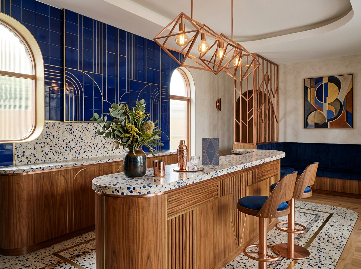
The cobalt blue used throughout the project refers to ocean depth, twilight skies and the saturated tones of mid-century travel graphics. Copper and coral add warmth without falling into a conventional gold-and-black casino palette.
Sand, cream and paper textures create a tactile editorial base. In the interiors, terrazzo, eucalyptus-toned timber, stone, woven surfaces and geometric metalwork connect the properties while allowing each region to remain distinct.
Opal House interprets city architecture through sharp lines, gallery lighting and shifting mineral colour. Southern Cross Grand uses heavier materials, darker timber and framed harbour views. Blue Dune opens to gardens and sunset, balancing red clay tones with water-inspired blue.
Urban culture influences the programming as much as the interiors. Markets, museums, local art, music and food are treated as essential parts of the guest experience rather than optional add-ons.
The initial framework considered how architecture, region and hospitality could be presented together.
City, waterfront and coastal settings were mapped as distinct visitor experiences.
Dining, wellness, events, accessibility and evening programmes were added to the comparison method.
Adelaide, Hobart and Broome became the basis of the collection.
Adult access, personal limits and support information became core content standards.
The visual system adopted its Australian Art Deco and retro-futurist travel identity.
Regional character leads every design and content decision.
Materials and layouts should support real guest behaviour.
Restaurants connect a stay to seasons, producers and culture.
Quiet rooms and wellness spaces are not secondary details.
Adult entertainment is presented without pressure or exaggeration.
Useful comparisons are more valuable than vague superlatives.